How do you honor 35 years of history while inviting a new generation through the door? Out With Purpose needed a bold, lasting brand that bridges both—one that radiates positivity and vibrancy so every LGBTQ+ person and ally feels welcome.
The Oak Park Lesbian and Gay Association was founded in 1989 as an inclusive group for local advocacy. By 2025, the group had evolved into the Oak Park Area Lesbian and Gay Association + (OPALGA+), one of the largest LGBTQIA2S+ membership organizations in Illinois.
The organization, recently renamed Out With Purpose, wanted to attract a more diverse range of LGBTQIA2S+ people and allies to its events, membership and board of directors. Bigmouth was tasked with building a new Out With Purpose brand identity that reflected this renewed sense of purpose.
BRAND STRATEGY
Turning self-awareness into action
This 2025 rebrand wasn’t the first time OPALGA+ changed with the times. The organization added “Area” to its name in 1995; the plus-sign (+) was added in 2019. On a larger scale, its purpose shifted from primarily social issues like marriage equality to social activities and academic scholarships.
In recent years, the OPALGA+ board of directors increasingly received feedback that the organization needed to promote greater inclusivity and grow more representative of the local LGBTQIA2S+ community. Legacy members were more likely to be cisgender, white gay men — people of other races, ethnicities, genders, gender expressions, and sexual identities didn’t always see their place in the organization.
In early 2024, the board voted to pursue a rebranding effort. The work would include a new name and brand, but remain true to the organization’s 35-year mission of building community and connection among LGBTQ+ people and allies.
From OPALGA+ to Out With Purpose
Prior to engaging Bigmouth, the OPALGA+ board worked with local marketing firm Famous Victory Branding & Design to explore perceptions and possibilities surrounding the organization itself, current and possible names, and issues involving identity and inclusivity.
The resulting name, Out With Purpose, accomplishes these key goals:
• Aligns with the organization’s mission
• Has a connection to the history of the organization
• Is not already in use and/or is not too similar to a name already in use
• Is easy to pronounce/remember
• Does not include outdated/exclusionary language
A proud past and a vibrant present
The Oak Park Lesbian and Gay Association (OPLGA) was founded to broadly call attention to the LGBTQ+ community in Oak Park. This grassroots group of friends and neighbors quickly grew into a registered organization working on social activities, political activism and cultural activities.
Original organizers recall how OPLGA created enfranchisement and belonging while adding support for young people and more opportunities to create community. Today, social gatherings and an academic scholarship fund are two of the organization’s main pillars.
“The one constant has been our desire to work together, to make sure that gay and lesbian people have the same respect and options as the rest of the community. And of course, the potlucks have endured.”
NATHAN LINSK, OPLGA FOUNDING MEMBER
The founders — now in their 60s and 70s — understand that to remain relevant and strong, it must tell a more inclusive story. This goal could only be accomplished by attracting new board members of varied genders and gender identities, ages, and racial and ethnic backgrounds.
Bigmouth engaged the Out With Purpose board of directors for a series of workshops and conversations that elevated not just their needs and goals, but those of the organization’s membership, community members and people who attend Out With Purpose events.
These board members spoke for hundreds or thousands of people with a vested interest in the organization — and naturally their opinions and needs didn’t completely align. Some legacy members were concerned about diminishing the organization’s history, while others were concerned that not every member of the LGBTQIA2S+ community would see themselves in the new brand.
This misalignment became clear as Bigmouth reviewed historical and current brand materials. In trying to speak to everyone, the Out With Purpose message became unfocused. The new brand identity needed to guide messaging, clarify purpose, and ensure marketing efforts resonated with all Out With Purpose audiences.
Together, we defined a brand strategy centered around inclusive imagery and language that clarify what Out With Purpose is, and who is welcome there.
KEY BIGMOUTH TACTICS
Developing vision, positioning, brand promise and positioning
Creating mood boards that both reflect the organization’s vibrancy and its respected position in the community
BRAND EXECUTION
Community-first approach
All members of the LGBTQIA2S+ community and allies are welcome at Out With Purpose, whether they’re dues-paying members, applying for a scholarship, looking for support for a young person or simply interested in checking out an event.
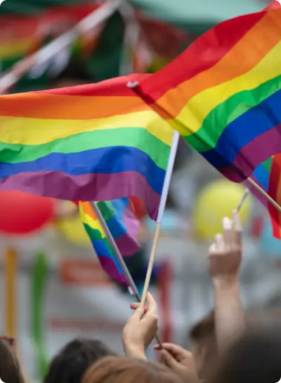
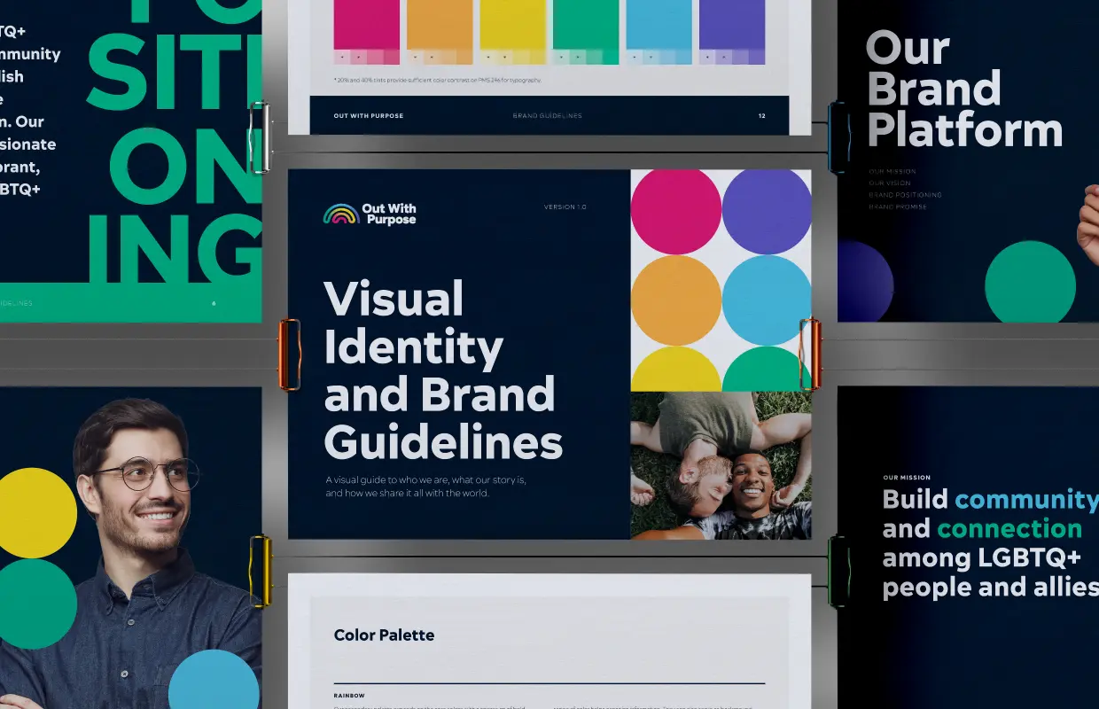
This deeply inclusive energy served as the basis of Bigmouth’s creative inspiration and brand tonality: Bold, dynamic, spirited, vibrant and welcoming. A new color palette encompassed all colors of the Pride flag, including neutral tones and a full-spectrum rainbow, giving the Out With Purpose team a diverse toolbox of tones for any brand application.
Communicating with diverse audiences naturally required a brand vocabulary centered on words like “community,” “connection,” “empowering,” and “opportunity. Bigmouth crafted messaging for two crucial Out With Purpose audiences to inspire both understanding and action:
The communities that engage with us:
Our team, our legacy members, our new members, soon-to-be-members, families and friends
The partners that support us:
Organizations and partners that donate/support, allied organizations and businesses
Brand Logo
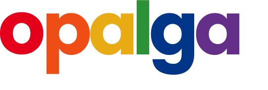
The logo exploration avenue explored several avenues, including an option inspired by Frank Lloyd Wright that honored Out With Purpose’s Oak Park heritage. The final brand logo features a playful rainbow shape and spectrum to create an instantly recognizable impact.
Photography
Photography was central to the visual identity—because when you’re telling human stories, the connection has to feel real. We established clear creative direction to ensure that no matter who was behind the lens, the images reflected real youth and young adults in honest, relatable ways.
BRAND LAUNCH
(Re)introducing a pillar of the community
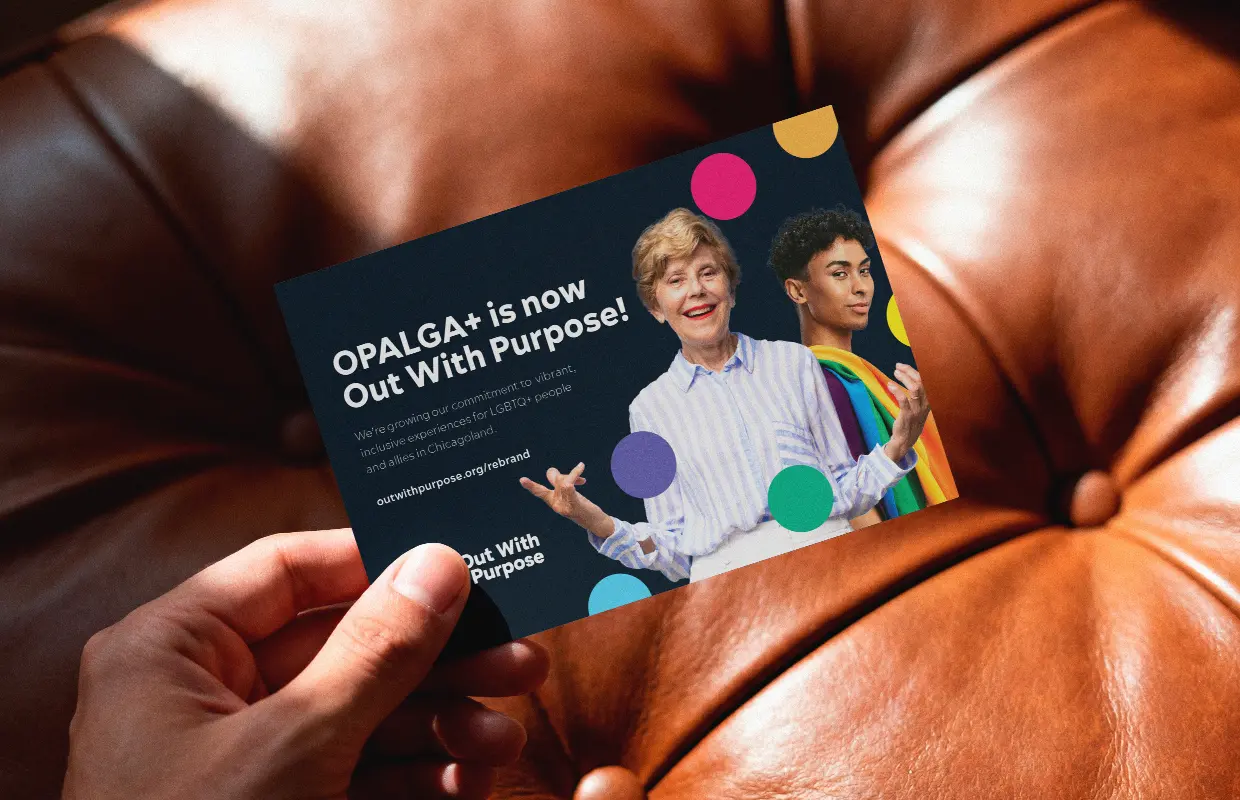
While the Out With Purpose board and membership actively participated in the entire rebrand process, the larger Chicagoland community wasn’t as clued-in to the big news. Bigmouth created special announcement postcards and social media posts that took Out With Purpose public.
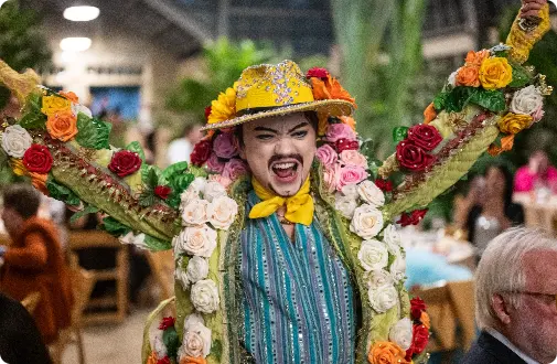
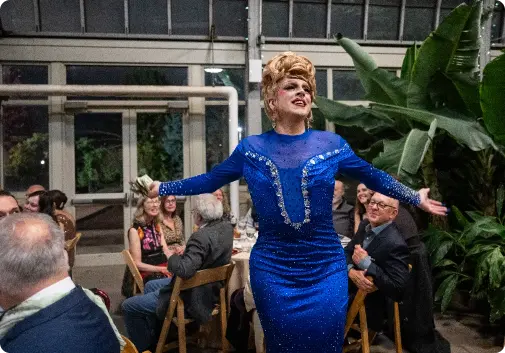
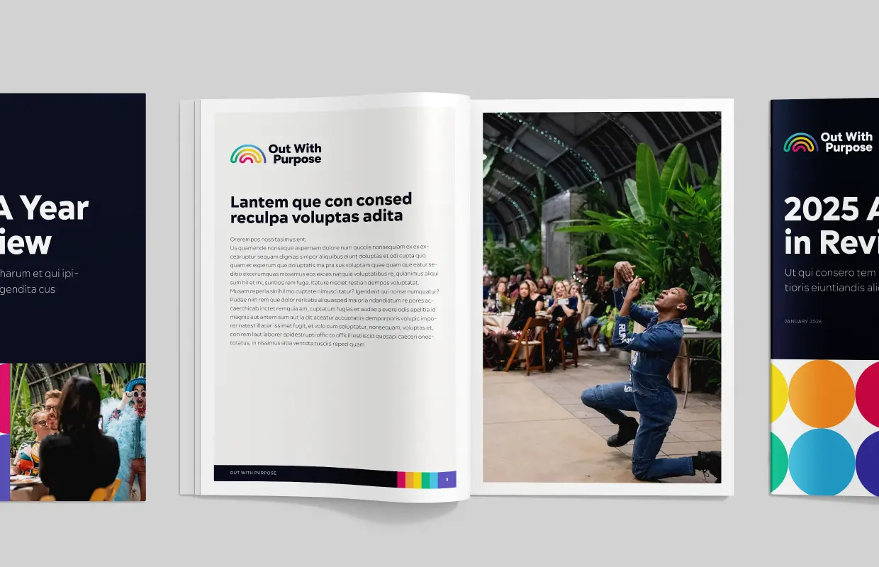
The new name and logo were also unveiled at Out With Purpose’s annual scholarship fundraising gala at Garfield Park Conservatory — a fitting celebration for an exciting new chapter.
KEY BIGMOUTH TACTICS
Aligning brand identity through a revised logo, broad color palette and enhanced photography and typography.
Creating key messaging that best communicates the Out With Purpose brand and authentically connects with audiences.
WEBSITE
A welcoming space for connection
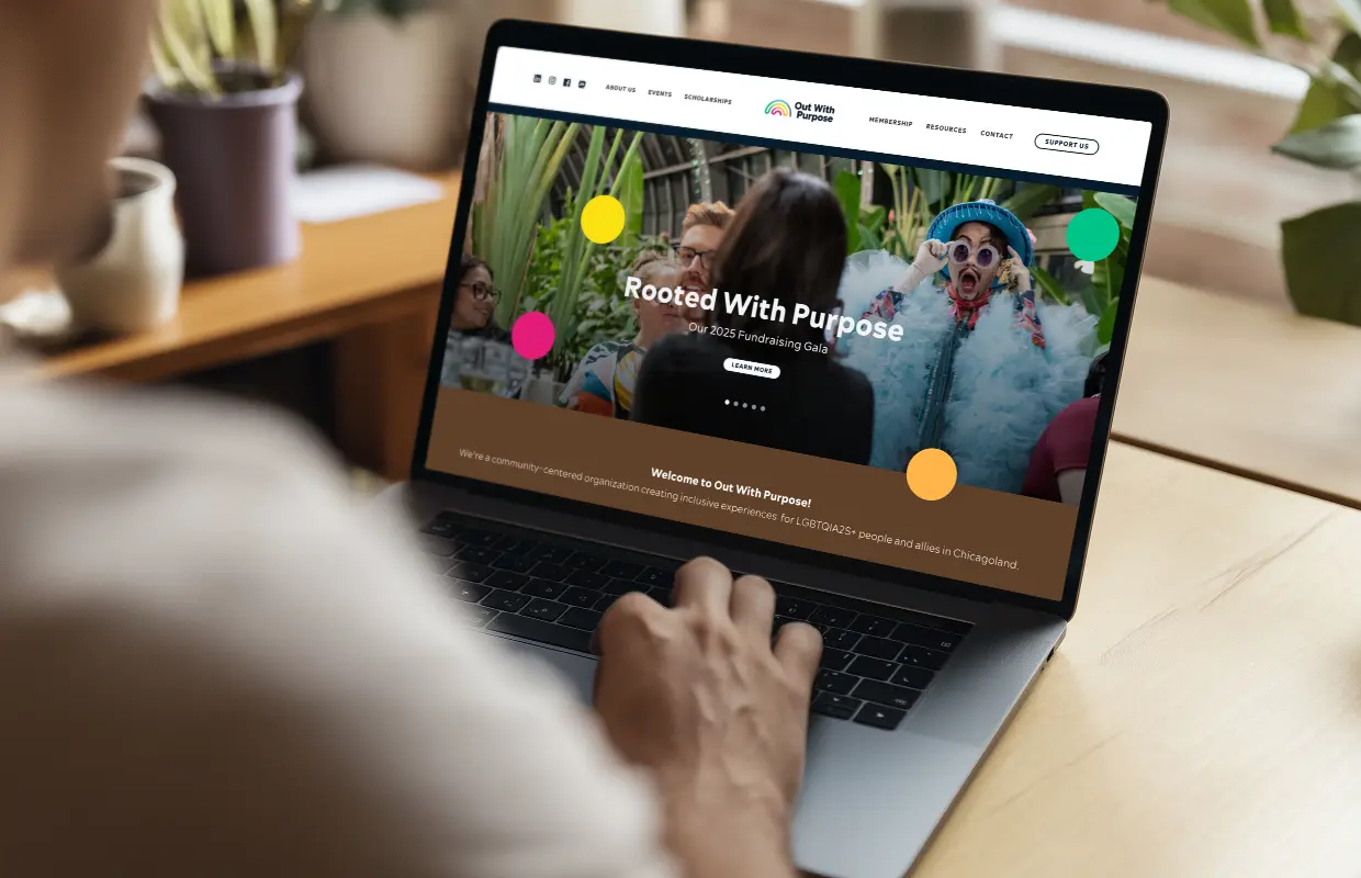
A brand-new brand needs a brand-new website, and the Out With Purpose relaunch stood as a perfect opportunity to go bold and bright.
Out With Purpose stands out as an organization primarily focused on in-person interaction in a digital age. The group’s website needed to exist as an extension of its diverse, inclusive membership, showcasing the myriad opportunities to contribute and connect. Visitors also benefit from a directory of trusted LGBTQ+ resources, designed to help the entire community thrive, connect and feel supported.
KEY BIGMOUTH TACTICS
Building a new Out With Purpose website from the ground up to reflect their new identity, clarify the user journey and ensure everyone feels welcome and represented.